Monday, 1 July 2013

Synergy of Magazine Adverts and CD Covers

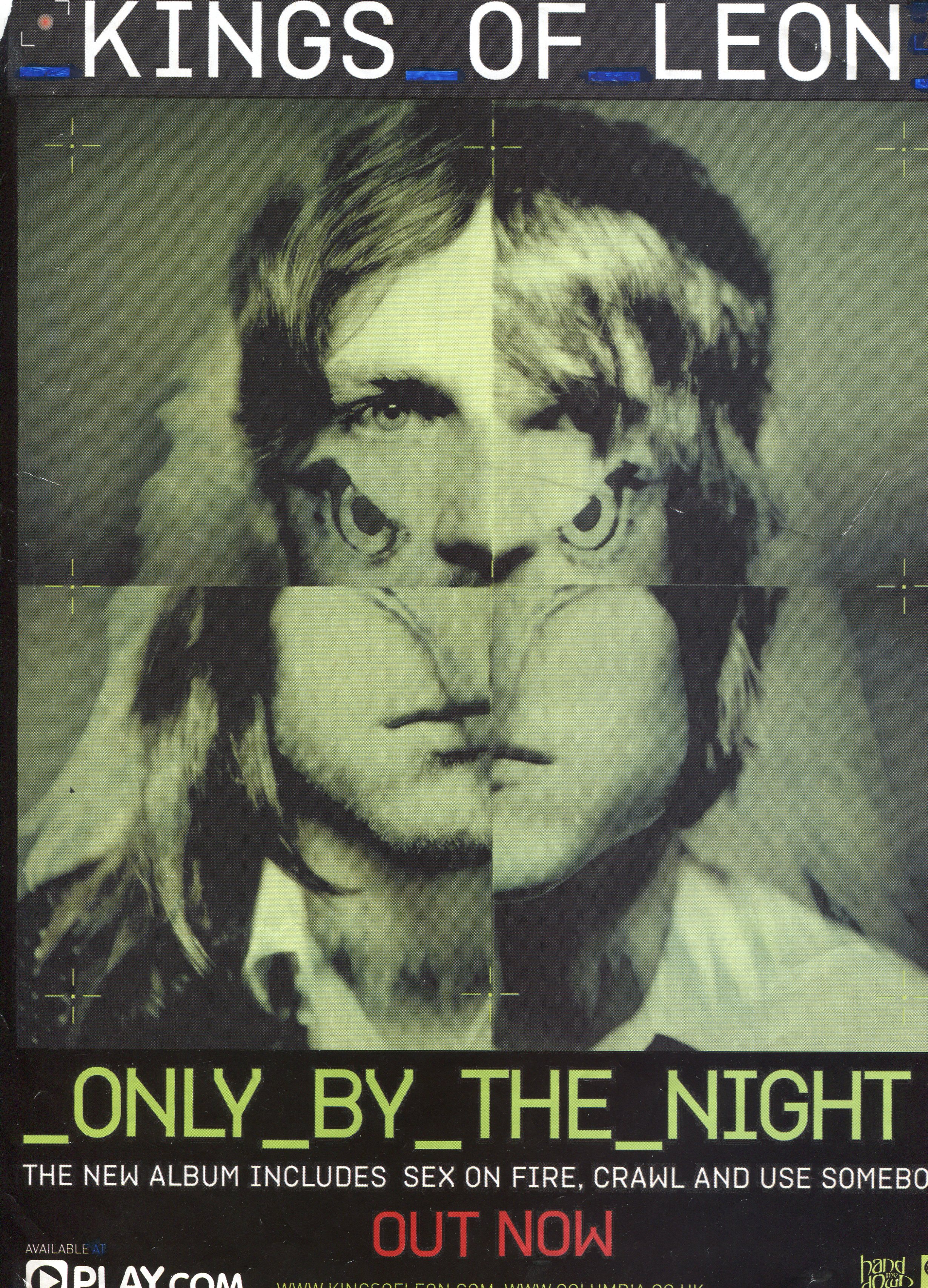
In order to create consistency between the magazine advert and the CD cover, it is important that the key features of each of them link up and intertwine in order to create a series of products. that is easily recognisable as being part of the same brand. This can be done through the use of same colours, whether light and bright for a pop band, or dark and shadowy for a metal band. They will usually both feature the same font for the band's name. Not only is this important for establishing the connection between the two, but it also shows that the music created is part of a brand. Similar images may also be used between the two, allowing the repeated images to be clear to the audience, and remain in their head long after they have seen the product/advert.


In this example of The Kings of Leon, the same colours have been used aswell as the same stylised fonts and image. A perfect example of creating synergy between the two and establishing the entireity of the product to it's target audience.

For our single, McFly, 'Five Colours in her Hair', we are going to try and use vibrant colours to match in with the band's 'sound' of being rather happy and upbeat, aswell as coinciding with the narrative of the song. Speaking of which, the hair chalk that I mentioned in a previous blog has arrived, so naturally the first thing we did was see if they worked. Me and Jorjah are excited about it but I think it's fair to say that Megan is slightly nervous. Should be fun either way!

These are links to the other members of the group's blogs:


No comments:

Post a Comment